Changelog
A new front page
aeqi.ai was rebuilt this week: the company computer on the door, the ten officers with the app's own orbs, drawn rows for memory, agents and server, one live proof number, pricing on the same system, and one spacing rhythm on every page.
September 14, 2026 · Luca Eich
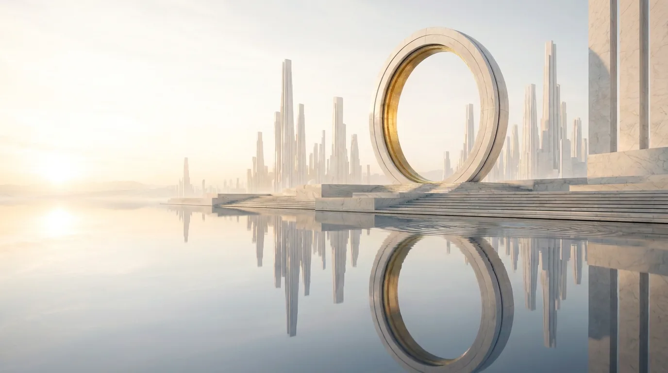
The front page of aeqi.ai was rebuilt from the door down. It now says what the product is in three words — The Company Computer — and shows it the way the app shows it. This is the list.
The page
- Hero. The monument at dawn as the plate, the eyebrow “The Company Computer”, the line “Build a company that runs itself.” Under it, one row: every model, the ten providers the runtime routes to, one company, the æ.
- The team. The ten officers as a register with the app’s own coloured orbs; pick one and read its jobs, a moment from its channel, the tools it works in and its skills.
- The product. The tour inside a browser window at app.aeqi.ai, with three chapters — Quests, Decisions, Memory — that seek the recording.
- The computer. Memory, agents and server as drawn rows; then, included in every plan, what it connects to (email, Slack, Teams, Telegram, WhatsApp; 314 tools across 31 services) and what it keeps (your keys in a vault, your codebase read before an agent edits).
- The proof. One live number — quests done — with the last thirty days of agent sessions, the founder’s post, Soonami and BEAM-100K.
- FAQ and footer. The title on the left, the questions on the right; a blue footer with the vault plate at the hero’s height, the closing line and the door above it, updates as one glass field.
Pricing
The pricing page is on the same system: a segmented switch for monthly and annual, Standard and Plus inside each card with the upgrade shown line by line, the founding offer as a pill on the card, and an enterprise door that books a call.
Every page
Every interior page opens the same way — a gold kicker over a centred serif title — and every band on the site keeps one spacing rhythm, named as tokens so the home, the pricing page, the blog and the docs move together. Serif titles are always the shade colour. The page holds at every width from 320px up.
Comparisons were rewritten into a shorter, more useful shape: a verdict at the top, a side-by-side table in words, where they win, where we win, one sentence on the difference, and a verified date. Each has its own image now.
The rest — why the name changed and what it means — is in The company computer.